

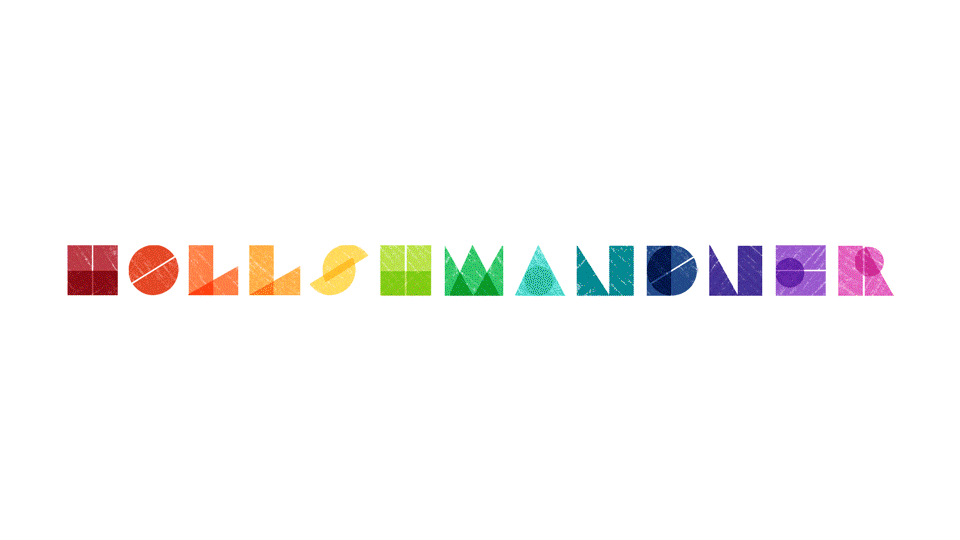
Illustrated Typography
This typeface originated from my illustrated typography class and my love of Bauhaus design. I wanted to combine elements that speak to me as a designer and create a typeface that I could set in motion and apply to a variety of contexts.
Motion Graphics
This organically developed into a website landing image when I began the designing process. I first created letters with a limited number of unique shapes (5) so that it could rotate and shift while maintaining their forms. AI planned the first and last frame of the motion graphic, then went straight into After Effects to figure out the transition.


Print Applications
I applied this font to two different Bauhaus themed posters. The first a more general example, and the second an MFA Bauhaus Exhibition Poster. Because of the Bauhaus inspiration for this font, I thought this would be an excellent context for the font to live in. I designed a mock poster for the exhibition displaying the 100 Years of Bauhaus Spirit film at the Boston Museum of Fine Arts.

I am also constantly inspired by Charley Harper's use of geometric shapes and striking silhouettes. I thought this font would also fit in well with his work, and applied it to the front of a Charley Harper coloring book.
